


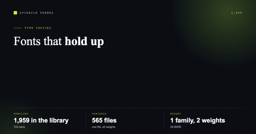
There are 1,959 font families in the Google Fonts library, and 722 of them are sans-serif. That is not a useful choice — it is a decision paralysis with a search box. The fonts that work on a website are the ones with a large x-height, open apertures, enough weights to build a hierarchy, and a file small enough that nobody waits for them.
This is a shortlist built on those criteria rather than on fashion, plus the pairings that actually hold up and the performance arithmetic that decides whether a choice is cheap or expensive.
What makes a font good on a screen
Four things, in order of impact:
- x-height. Large x-height means the lowercase letters occupy more of the line, which reads better at 16–18px. This is why Inter, Roboto and Work Sans feel comfortable at body size while elegant display serifs do not.
- Open apertures. The gap in letters like c, e, s, a. Tight apertures blur together at small sizes and on cheap phone screens.
- Weight range. You need regular, medium and bold at minimum. A family with one weight forces the browser to synthesise a fake bold, which looks smeared.
- Variable or not. 565 of the 1,959 families ship as variable fonts — one file covering every weight. Static families need a separate file per weight, and each one is a request.
The shortlist for 2026
For body text and interfaces
Inter. Variable, 18 style variants, designed for screens. Neutral enough to disappear, wide enough to stay legible at 15px. If you want one font for the entire site and no pairing decisions, this is the safe answer.
DM Sans. Variable, 20 variants, slightly geometric with a friendlier tone than Inter. Good for service businesses that want to look modern without looking like a SaaS dashboard.
Plus Jakarta Sans. Variable, 14 variants. Distinctive g and a, works well in headlines as well as body copy, which means one family instead of two.
Work Sans. Variable, 18 variants. Optimised for mid-size text; the slightly condensed feel fits dense layouts and tables.
Manrope. Variable, 7 variants. Minimal, semi-rounded, useful when the brand is technical but not corporate.
Geist. Variable, 18 variants. A newer arrival that has become the default modern-developer look — clean, tight, and best at 16px and above.
For headings and editorial
Playfair Display. Variable, 12 variants. High-contrast serif with real personality; excellent for a single H1 per page, wrong for paragraphs at 16px.
Fraunces. Variable, 18 variants. A softer, quirkier display serif with optical sizing — it holds up better than most display faces when a title runs long.
Merriweather. Variable, 14 variants. Designed for screens at small sizes; one of the few serifs that works as body text without a size bump.
Source Serif 4. Variable, 16 variants. A workhorse text serif with genuinely good italic — the choice for long-form articles that should read like a publication.
Newsreader. Variable, 14 variants. Slightly narrower, editorial feel, good for blog archives and magazine layouts.
For labels, buttons and small caps
Montserrat. Variable, 18 variants. Wide, geometric, all-caps friendly — this is the font that made “eyebrow” labels above headings a trend.
Space Grotesk. Variable, 5 variants. Technical, slightly odd letterforms that make short labels feel designed rather than typed.
Five that are popular but need a caveat
| Family | Status | The caveat |
|---|---|---|
| Poppins | Static, 18 styles | Very wide letterforms; long headings wrap early, and each weight is a separate file |
| Lato | Static, 10 styles | Fine, but showing its age next to variable options; static files add requests |
| Instrument Serif | Static, 2 styles | Gorgeous, but a display face with no bold — never use it for body copy |
| Roboto Slab | Variable, 9 styles | Heavy visual weight; good for one line of emphasis, tiring in a full section |
| Libre Baskerville | Variable, 8 styles | Large x-height and wide set; at 18px+ it is lovely, at 14px it is cramped |
Pairings that work
The rule that survives every trend: pair a neutral text face with a face that has one distinctive trait, and give each a clear job.
| Use case | Headings | Body |
|---|---|---|
| Agency / studio | Playfair Display | Inter |
| Local service business | Plus Jakarta Sans | Plus Jakarta Sans |
| Blog or publication | Fraunces | Source Serif 4 |
| SaaS / product | Geist | Inter |
| Portfolio / creative | Space Grotesk | DM Sans |
| Long-form docs | Work Sans | Work Sans |
Note how often the answer is one family used twice. A single variable family in two sizes and two weights is both the fastest option and, usually, the most coherent design.
The performance arithmetic
A font file is a render dependency: browsers hold text invisible or swap late, and both show up in Largest Contentful Paint. The budget that works on a 3G phone:
- One family, variable, subset to latin: typically 20–60KB for the whole weight range.
- Two static weights in the same family: often 2 files of 25–40KB each, which is worse than one variable file.
- Four weights plus italics, static: easily 200KB+ of downloads before the first paragraph paints.
Core Web Vitals thresholds are LCP at 2.5s, INP at 200ms and CLS at 0.1. Fonts mostly threaten the first two indirectly and CLS directly — a late swap that changes line heights moves every paragraph below it, which is exactly what CLS measures.
The two settings that prevent that: font-display: swap so text is readable immediately, and a fallback stack with similar metrics (a system UI font for a neutral sans, Georgia for a serif) so the swap does not reflow the page.
Accessibility checks before you commit
- Body text at least 16px, line-height 1.5 or more. Google Fonts’ default line spacing is tighter than web body copy wants.
- Contrast of 4.5:1 for body, 3:1 for large text — the WCAG 2.2 AA minimums. A thin light-grey weight on white fails this regardless of the font.
- Never below 300 weight on a light background. Thin faces and small sizes are the most common legibility failure.
- Test a real paragraph at 390px wide. Some families look fine on a 1440px canvas and fall apart in a phone column.
Common questions
How many Google Fonts should a site use?
One family, two or three weights. Two families if there is a genuine editorial split between headings and text. More than that is decoration, not typography.
Are variable fonts always better?
Usually, but not always. A variable file carries every weight, so it is bigger than a single static weight — if you only need regular, a single static file can be smaller. You need variable when you use three or more weights, or when you animate weight.
Which font is easiest to read?
At body size, anything with a large x-height and open apertures: Inter, Work Sans, DM Sans and Merriweather all qualify. Readability comes more from size and line-height than from the family itself.
Can I use these commercially?
Yes — the library is open source, mostly under the SIL Open Font License, which allows commercial use, embedding and modification.
Once you have chosen, the next step is getting the files served from your own domain rather than Google’s — the four methods are compared in how to import Google Fonts in WordPress.