Web design plays a vital role in creating a successful e-commerce site. The best product in the world can easily be overlooked if the design is not there to support the presentation.
The best part about eCommerce web design, development, and advice is that a lot of it is based on data and case studies. While there is always room for creativity and inspirational expression, data-driven advice guarantees tangible results.
After all our ultimate goal is to sell more of what your brand has to offer. Whether it’s through clever design elements or bold statements that will make customers curious to find out more.
Great web design inspires users to take action, but it also helps build the trust that users have in your brand. Action is what drives sales, and the layout is there to help encourage users to take actions like shopping or communicating.
This article is for anyone looking to polish their eCommerce website design. It doesn’t matter if you use WordPress, Wix, BigCommerce, a custom eCommerce platform, or hire eCommerce developers. The lessons and tips outlined below are universally applied as modern design principles.
Let’s get started!
1. Tell a Story
Great products have great stories behind them. Anyone can build an ecommerce site and sell whatever they want. But no one can create a successful brand image around their product.
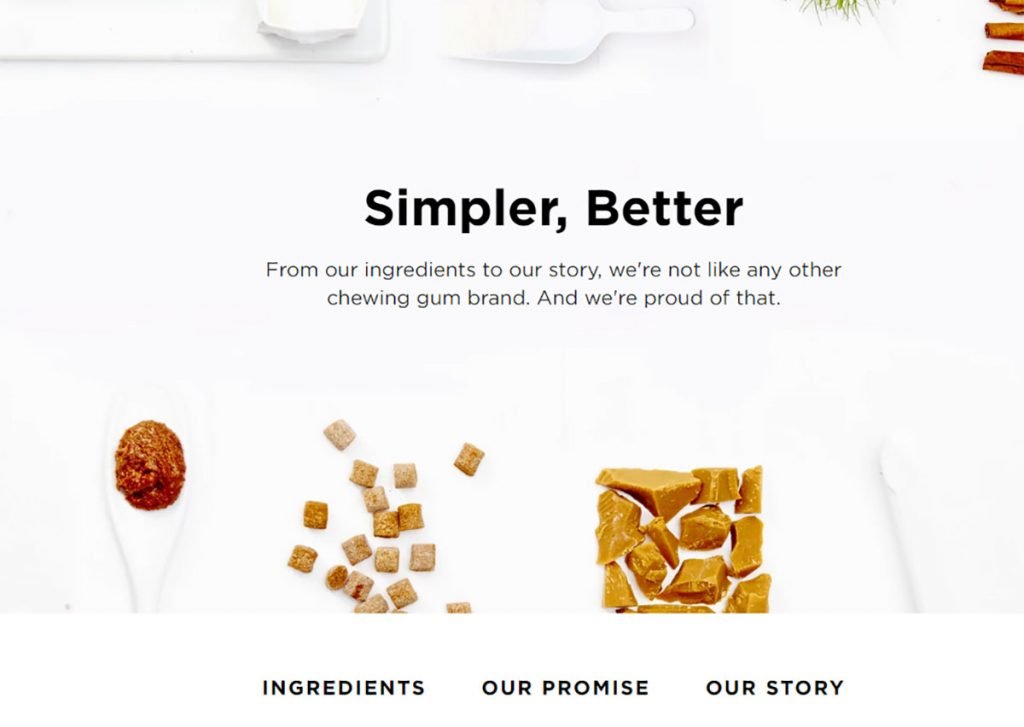
Image Credits: https://www.simplygum.com/
Your ability to tell a compelling story about your brand will help develop a strong brand image. Additionally, storytelling encourages loyalty. Customers are more likely to remember your brand if they feel that you are sincere and personal. And the best way to be personal is to tell a story.
- What made you create your product?
- How did your product affect your life?
- What is your vision for the future?
- Who is your target customer?
Once you start answering these questions, you can have a much clearer idea of how to structure your eCommerce design. Make users feel like they are part of something special.
Wouldn’t you like customers to return to your store because they were inspired?
2. Create Fewer Options
There is nothing more unpleasant than a sloppy browsing experience in the store. The goal of the sale is to get users to add items to their shopping cart. But if your browsing offers hundreds of options, users will quickly lose patience and leave the site entirely.
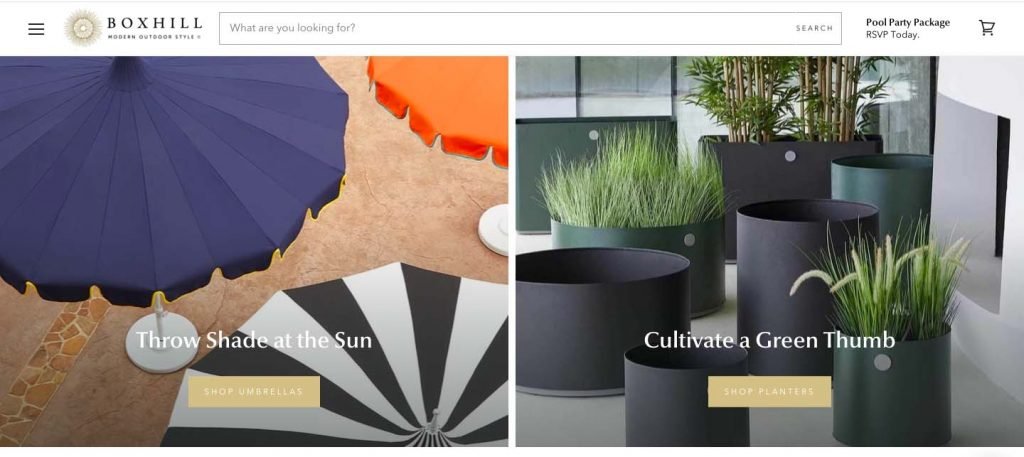
Image Credits: https://shopboxhill.com/
Walmart is a great example of what not to do unless you want to scale for long-tail sales. Your navigation provides an overly cluttered list of navigation options, making you feel queasy when you finish finding what you need.
The easier it is for customers to find a specific product, the more time they will have to read about the product and ultimately make a purchase.
Helpful: Experiment with crafting a navigation structure using Sketch, Photoshop, or any other wireframe tool. Analyze the process of users arriving at the home page, navigating a directory, and finally arriving at the product page.
This is possibly one of the most important design tips for ecommerce sites.
3. Color Inspires Emotion
Colors have had a psychological impact on sales long before the digital revolution. By understanding the different types of emotion colors can elicit, you can design your eCommerce site to match certain feelings and vibes. To get a digitally perfect estore you can hire eCommerce developers from India at affordable rates.
Here is a table showing the emotions commonly associated with different colors:
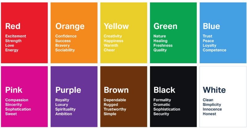
Image Credits: https://londonimageinstitute.com/
Depending on your product and target audience, you can use color to invoke certain feelings. For example, if your store sells organic products or products, the color green will complement the sense of nature.
According to development stats, it takes about 90 seconds for customers to formalize their opinion on a product. And a large part of that interaction period, around 70%, is set exclusively on colors.
4. Consistency Matters
Users remember your brand design not because of an eye-catching name but because of the overall brand image it presents. In terms of web design, this mainly has to do with the way you structure your pages.
Do you use the same fonts and colors on all pages? Strong typographic patterns can instill a memorable experience in the minds of your users.
Also, if you use a variety of different colors on multiple pages, you risk looking like a multivariate brand.
As a result, if you want to be recognized and remembered, it is imperative that you focus on using similarities in your design patterns. Even if your product has many branches, designing pages with similarities in mind only helps create a stronger brand presence. And that’s the ticket to boost your sales.
5. Experiment with Urgency
The urgency is mainly based on exclusive offers and promotions. As seen in the photo above, Bestbuy uses the top of its home page to highlight irresistible offers. But are there other methods to promote a sense of urgency?
One of the main reasons customers abandon their shopping cart is high shipping prices. Therefore, this creates an opportunity to capitalize by offering special offers on shipping costs.

Image Credits: https://unsplash.com/
This is also a tactic used by brands like Bestbuy. And Amazon is known for its Prime service. Top users get free shipping on almost all products exclusively. You can also encourage users to spend a certain amount in your store and get a free shipping fee in return.
Another form of urgency is to limit the stock available for a certain product.
Here is a beautiful crew neck sweatshirt based on the holidays. The offer includes free shipping to the US but is available for a specified period only. This is a great example of urgency used in eCommerce store design.
Can you think of other ways to promote urgency? We would love to hear your views and success stories.
6. Clear and Beautiful Photos
There is a lot of data to support the claim that high-quality, relevant, and visually appealing images help increase conversion rates. And we are not just talking about product images.

Image Credits: https://unsplash.com/
The images you use in your overall design can go a long way in captivating users attention.
A great photo instills emotion, creates a sense of identity, and is easily remembered. The average person can retrieve up to 2000 images with near-perfect precision.
That said, products will not be sold unless there are photographs to support the product design. As an e-commerce store owner, it is critical that you do your best to captivate the essence of your product through high-quality photography.
Best of all, you don’t need to hire an expensive photography platform to get the job done. There are many tutorials and how-to guides on how to take exceptional product photos using nothing but your phone or an inexpensive camera.
Sites like Pexels and Unsplash are known for offering stunning, professional photography without a license.
7. Use A/B Testing Frequently.
As we come to the final part of our design tips for ecommerce sites, let’s close the list by looking at A/B testing.
A/B testing is necessarily the means of using two different website designs simultaneously. A is one version, and B is another.
Then after some time has passed, you can compare the metrics for each version separately. The metrics you can monitor include conversion rates, usability, and overall engagement for different parts of the design.
Even a small design change can have drastic improvements in user engagement. Likewise, trying out different color variations and more can give you a much clearer idea of where to focus for your future designs.
You can find numerous tools for website optimization and A/B testing in our Nexus directory.
Wrapping Up
We all are well aware of the success of the eCommerce industry. But there have been many catastrophic incidents too. Many eCommerce startups failed due to improper execution of their eStore.
This is why I wrote this article. Following these simple yet effective tips can save your hard-earned money and reputation both. All you need to do next is to invest in the right eCommerce website development company in India and let the magic happen.


